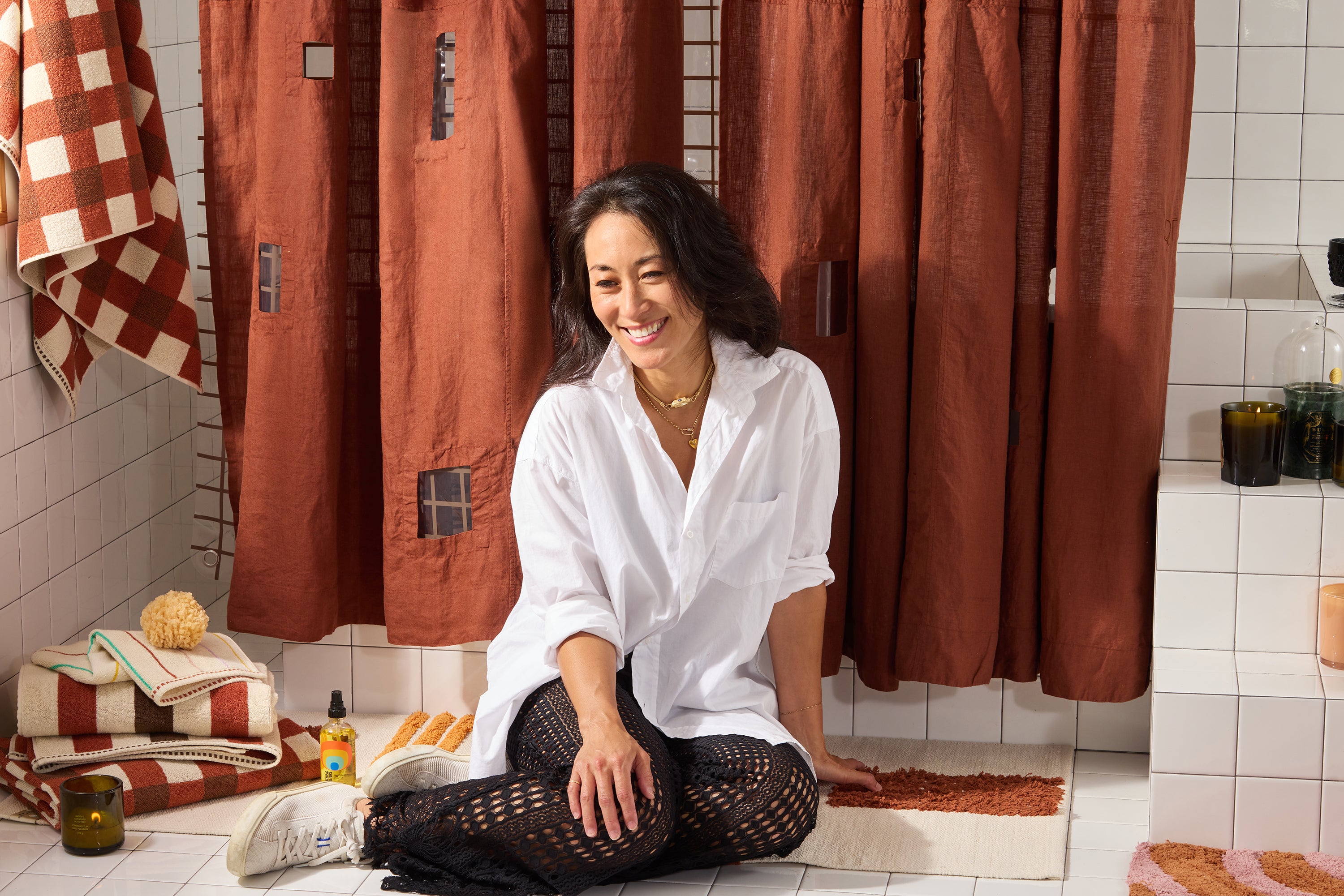
Studio Sessions with Susan Work
Meet Susan Work, San Francisco-based interior designer and one half of Homework, the design studio she runs with her husband, architect Ben Work. Susan brings a love of candlelight, color-drenching and luxurious, textural volume onto our Quiet Town studio; a sensibility she translates artfully for all of her clients.
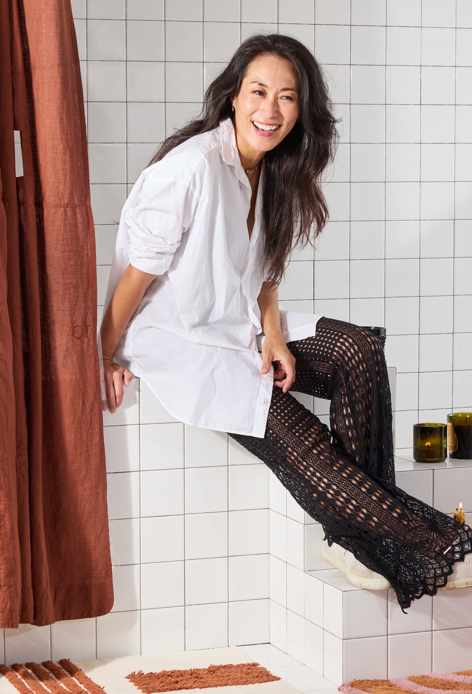
QT: How would you describe your signature interior design work?
What do people want from you when they hire you?
SW: No matter the architectural style, we create refined spaces that are layered, artful, fun and functional. Elevated but warm.
Our clients- no matter who they are- all want spaces that are visually compelling, unique, comfortable, livable, and not too precious. Environments that can support their growth through every season of life- both beautiful and messy.
QT: What drew you to the pieces
you pulled from Quiet Town for this Studio Session?
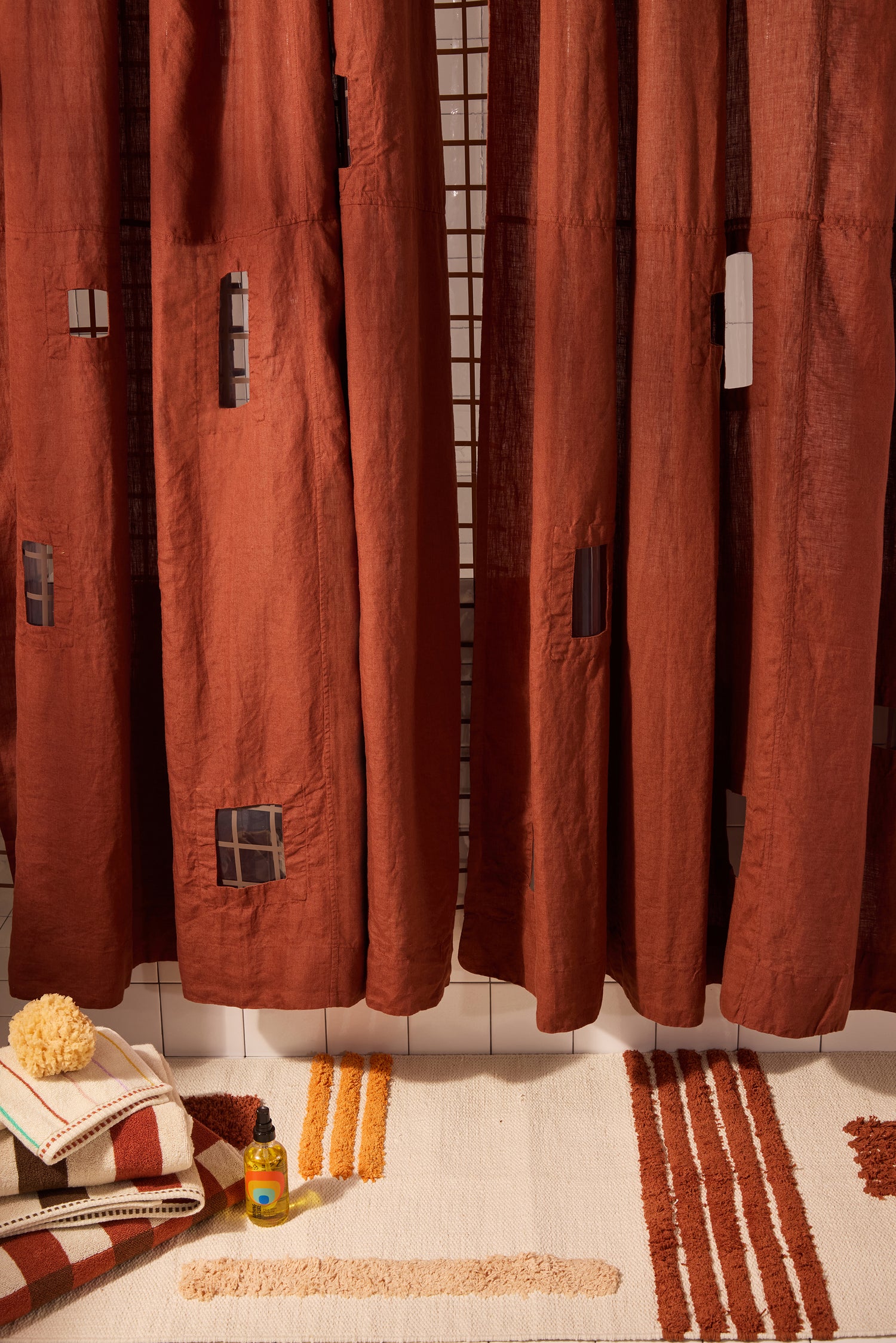
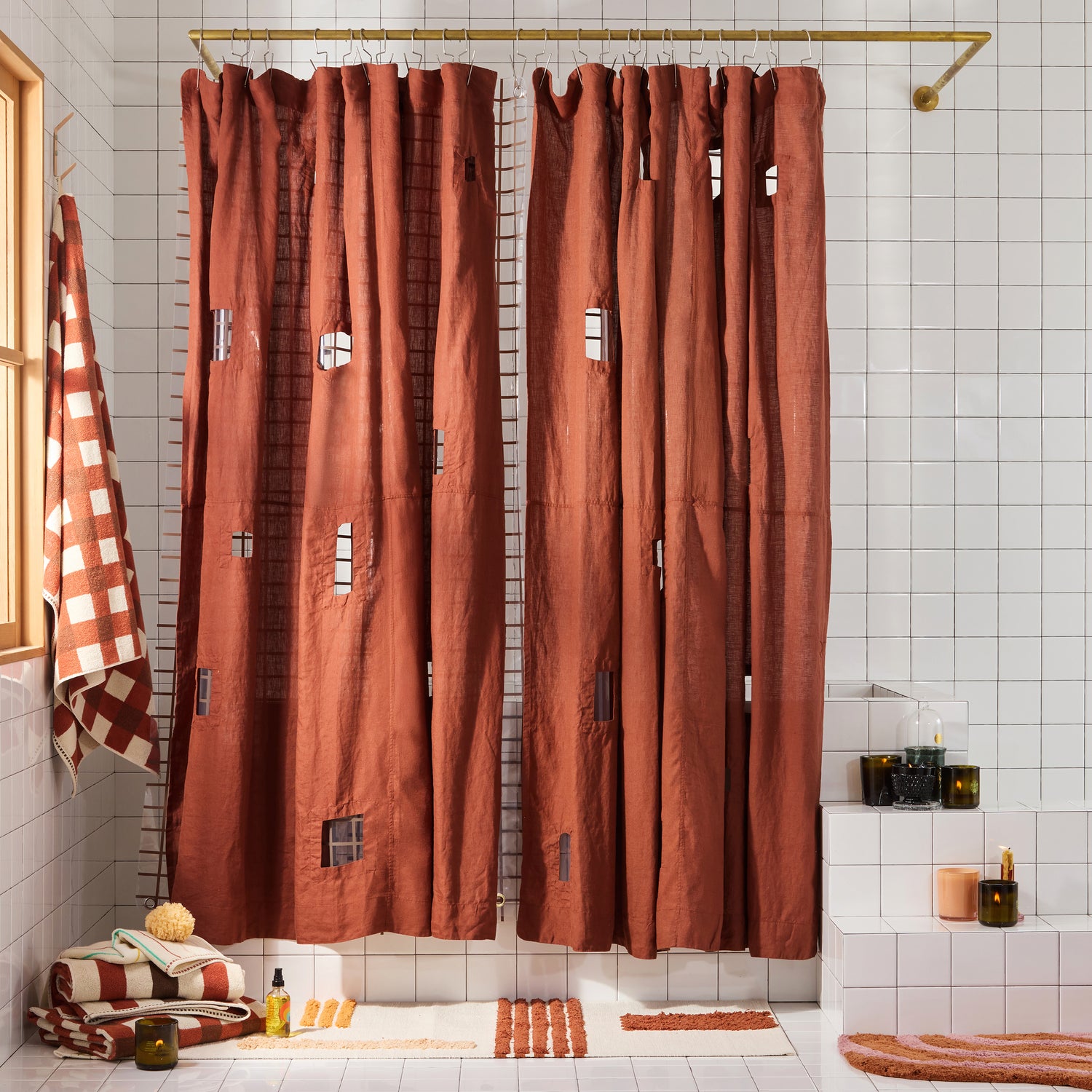
SW: We use a lot of earth tones in our palettes, so I was
immediately drawn to the burgundy curtain. Not to mention the cut-outs are a smart, cool design detail that make the piece dynamic. It reminds me of clothing and spaces I'm drawn to: solid, rich color with perforations, negative spaces, and windows that peep and overlay an added dimension beyond. I haven't seen checks and linework graphics done on towels that harmonize together quite like Quiet Town's
collection- so I wanted to bring it all together for a lively, punchy story.
QT: Any thoughts on shower
curtains? When do you opt in or out of using them?
SW: Shower curtains are drapery, and we love drapery for all of the dimensionality and texture it adds. When we design drapery, our studio standard is to double up our stacks to 2x fullness.
Though a lot of showers we design are enclosed with glass, we definitely love a soft textile in an otherwise hard-tiled space. Shower curtains are cozy, elegant, and warm as opposed to the harder, more modern look
of glass, and it really drives the vibe of sensualizing the bathroom routine and elevating the mundane into ritual.
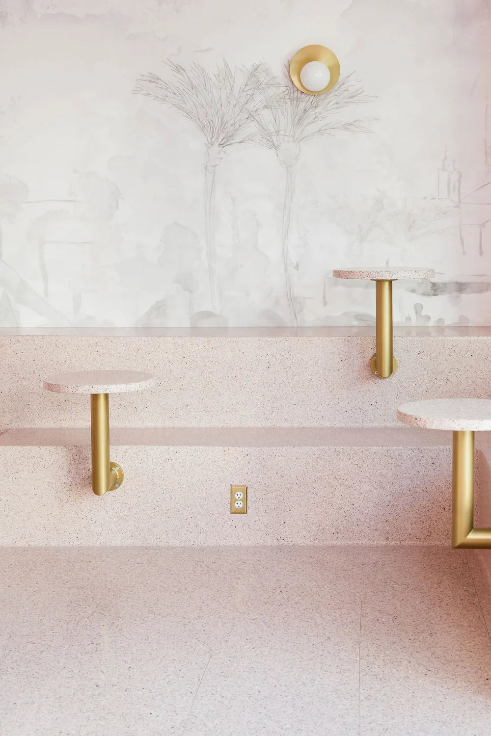
QT: I know you love to design using exaggerated, tonal layers of color. Is there an example of your work that speaks directly to your color-drenching philosophy?
SW: We designed a matcha cafe that was completely monochromatic. We toned down the hue of pink and spread it all over the space, which surprisingly resulted in a more calming, minimal, and sophisticated effect than we anticipated. It created good tension between the dramatic visual impact of a singular color everywhere without feeling burdened or sensory overload.
